A picture is worth a thousand words; this saying takes on a new meaning when we delve into the world of infographics in graphic design. Infographics have revolutionized how we present complex data, transforming it into visually compelling stories. In this article, we will unlock the power of visual storytelling, revealing how epIQ Creative Group and other innovative design agencies are using graphic design and infographics to create engaging, memorable content.
For marketers, business leaders, and anyone looking to communicate information clearly and effectively, infographics represent a potent tool in your arsenal. They combine the best of text and visuals, using design principles to turn data into engaging narratives that capture your audience’s attention. This article will guide you through the what, why, and how of infographics, shedding light on their pivotal role in effective graphic design.
Whether you’re a seasoned professional in the field or just starting to explore the potential of infographics for your business, this comprehensive guide will provide valuable insights. So, let’s dive in and explore the transformative power of infographics in graphic design.
Understanding Infographics: More Than Just Graphic Design
The art of graphic design is not just about creating visually appealing images; it’s about communicating complex information in an easy-to-understand way. And nothing exemplifies this better than infographics.
The Definition of Infographics
At its core, an infographic is a visual representation of data or information. It combines images, charts, and minimal text to provide a quick and clear overview of a topic. Infographics are powerful tools for visual communication, offering a unique, creative, and engaging way to express information that grabs attention and facilitates understanding and retention.

The Difference Between Graphic Design and Infographics
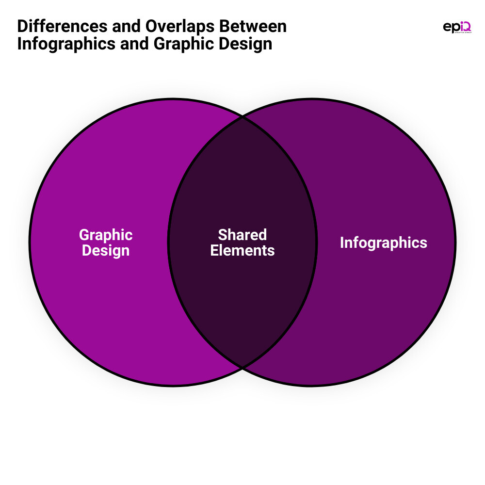
While both graphic design and infographics involve visual communication, they are not interchangeable. Graphic design is a broad field that encompasses various forms of visual content, including logos, banners, brochures, and more. It is about creating images that are aesthetically pleasing and convey a specific message or concept.
On the other hand, infographics are a specific type of graphic design that focuses on transforming complex data into easily digestible visual content. Not every piece of visual content with text qualifies as an infographic. It is the strategic use of data visualizations, like pie charts and bar graphs, coupled with minimal text and striking imagery that makes an infographic.
The Role of Graphic Designers in Creating Infographics
Graphic designers play a crucial role in creating infographics. They use their expertise in design principles and techniques to create visually engaging infographics that effectively communicate the desired information. They consider color psychology, balance, lines, typography, contrast, scale, proximity, hierarchy, repetition, direction, and space in their designs.
While there are tools available that allow non-designers to create infographics using templates, a professional graphic designer can create custom infographics tailored specifically to your brand. Their ability to understand and interpret data, coupled with their skills in visual design, enables them to transform complex information into a compelling visual narrative that resonates with the target audience.
In essence, infographics represent the perfect blend of art and science, and graphic designers are the artists who bring this blend to life. By understanding how to leverage the power of infographics in graphic design, businesses can communicate more effectively, engage their audience, and leave a lasting impression.
The Four Types of Infographics and Their Applications
The world of infographics is as diverse as the data it represents. With a variety of formats and styles, these visual tools cater to different types of information and audiences. Here, we’ll dive into four main types of infographics: Statistical, Timeline, Location, and Comparison infographics. Each of these have their unique applications and can be a powerful tool in your visual communication arsenal.
Statistical Infographics: Turning Numbers into Narratives
Statistical infographics, as the name suggests, are all about numbers. They are primarily used to visualize complex data or statistics in an easily digestible format. These infographics often include charts, graphs, and other forms of data visualization to help convey their message. They tend to focus more on standalone facts and big numbers, making a bold statement with the data. For example, an infographic about the state of the gig economy might use statistics to highlight the number of people participating in side hustles and the income they generate.
Timeline Infographics: Visualizing History and Processes
If you’re looking to tell a story through time or elaborate on a series of events, timeline infographics are your go-to. These infographics effectively illustrate a chronological sequence, making them perfect for narrating history, explaining step-by-step processes, or visualizing project timelines. They often use a linear, progressive layout that guides the viewer from one point to another, creating a narrative flow.
Location Infographics: Mapping Data for Clarity
Location or geographic infographics are ideal when you need to present location-based data. They use maps as their primary visual, allowing viewers to immediately grasp the geographic context of the information. Whether it’s showing the distribution of a population, tracking the spread of a disease, or simply highlighting locations of interest, these infographics can make geographic data far more intuitive and engaging.

Comparison Infographics: Making Choices Clearer
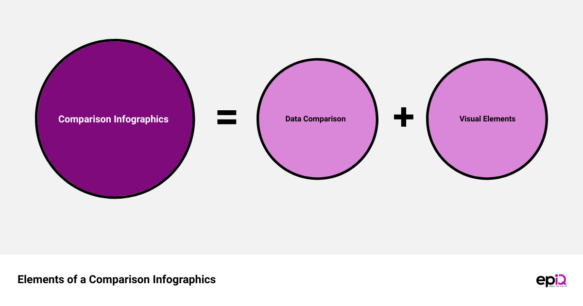
Comparison infographics are designed to help viewers understand differences or similarities between two or more subjects. They typically use side-by-side layouts to present information in a parallel way, making it easy to compare and contrast. Whether it’s comparing product features, showcasing pros and cons, or highlighting differences between two concepts, comparison infographics can simplify complex comparisons and help your audience make informed decisions.
In summary, choosing the right type of infographic depends largely on the nature of your data and the story you want to tell. By leveraging these distinct infographic styles, you can transform your data into compelling narratives that engage, inform, and captivate your audience.
Showcasing Creativity: A Look at Some of the Best Infographics
Dive into a visual feast! Explore the world of infographics through examples that epitomize the power of data turned into compelling narratives. Each category represents a unique style, offering diverse ways to communicate information and engage audiences effectively.
Infographics About Infographics: Meta-Visualizations
Yes, you read that right! Infographics about infographics exist. They are meta-visualizations that unravel the process, technique, and impact of infographics. Beth Kanter’s design about “What is an Infographic?” is one such example. It uses simple yet effective Lego graphics to explain how visual order can help audiences draw conclusions.
World Infographics: Global Data in Focus
World infographics offer a bird’s eye view of global data, capturing trends, patterns, and comparisons across countries. For instance, the ‘World’s Most Popular Artist’ infographic by Ken Bromley Art Supplies presents a stunning visual exploration of art preferences spanning countries and eras.
List Infographics: Organizing Information Effectively
List infographics are excellent tools for organizing information into an easy-to-read format. They can range from simple top-ten lists to more complex visualizations that categorize and rank data.
Instruction Infographics: Guiding with Graphics
Ever struggled with assembling furniture or following a complex recipe? Instruction infographics are here to save the day! They break down complex processes into manageable steps, using visual cues to guide users effortlessly.
Comparison Infographics: Side-by-Side Data
Comparison infographics make choices clearer by presenting side-by-side data. They can be used to compare products, services, or any other sets of data, making them a powerful tool in decision-making processes.
Process Infographics: Step-by-Step Visuals
Process infographics visually break down a sequence or workflow into easy-to-follow steps. They are particularly effective in explaining complex processes in an easy-to-understand format.
Key Findings Infographics: Highlighting Important Data
Key findings infographics distill the most important data or results from a study or survey. They highlight the critical takeaways, making it easier for readers to grasp the essence of the information.
Timeline Infographics: A Journey Through Time
Timeline infographics are a visual journey through time. They tell a chronological story, tracing the history of a product, company, or concept. Sam Gilbey’s ’50 years of Doctor Who’ is a classic example of a timeline infographic done right.
Complex Data Infographics: Simplifying the Intricate
Complex data infographics take intricate, often overwhelming data sets and simplify them into visually pleasing and easily digestible formats. Juan Martinez’s ‘History of Life’ infographic is a brilliant example of showcasing complex geological data in an engaging way.
How-to Infographics: Visual Guides for Tasks
How-to infographics serve as visual guides for tasks, providing step-by-step instructions that are easy to follow. They transform traditional how-to guides into engaging, visually stimulating content.
Whether it’s a simple list infographic or a complex data visualization, the power of infographics lies in their ability to transform dry, complicated data into engaging, informative, and visually pleasing content. They truly represent the perfect marriage of data and design.
The Role of Platforms Like Behance in Showcasing Infographics
In today’s digital era, platforms like Behance have emerged as crucial tools for graphic designers and infographic creators to showcase their work. Not only does it provide a space for portfolio building, but it also opens up networking opportunities and job prospects. But what are the specific benefits of using Behance for infographics?
Building a Portfolio of Infographics on Behance
One of the key advantages of Behance lies in its ability to serve as a powerful portfolio platform. For graphic designers specializing in infographics, Behance offers a unique space to showcase their work to a global audience. The platform allows designers to upload their infographics, arrange them in an organized manner, and present them professionally. This is a fantastic way to demonstrate your skills, creativity, and versatility to potential clients or employers.
Networking and Job Opportunities on Behance for Infographic Designers
Behance is not just a portfolio platform; it’s also a thriving community of creative professionals. This makes it a fertile ground for networking. Engaging with other designers, exchanging ideas, and receiving feedback can lead to collaborations, partnerships, and even job opportunities. Many companies and organizations use Behance to scout for talent, making it a viable platform for infographic designers looking to expand their career prospects.
The Benefits of Using Behance for Infographic Designers
In addition to portfolio building and networking, Behance offers several other benefits to infographic designers. First, it exposes your work to a wide audience. This can lead to increased visibility, recognition, and potentially, business opportunities. Second, Behance’s user-friendly interface allows designers to showcase their work in the most effective way. You can add descriptions, links, and tags to your projects, optimizing them for search and making them easily discoverable. Lastly, Behance is integrated with other Adobe products, making it seamless to upload your work directly from your Adobe applications.
In conclusion, Behance plays a significant role in the world of infographics. It serves as a platform for showcasing your work, connecting with like-minded professionals, and opening up job opportunities. For infographic designers, leveraging platforms like Behance can be a game-changer in elevating their career and reaching a broader audience.
How epIQ Creative Group Utilizes Infographics in Their Services
From social media assets to print materials and logo design, the power of infographics is harnessed in a myriad of ways at epIQ Creative Group. They understand the value of visual storytelling and utilize infographics to transform data into compelling narratives, making complex information easily digestible and engaging.
Infographics in Social Media and Digital/Print Material Design
In the digital age, social media platforms are the new marketplace. epIQ Creative Group uses infographics to create visually striking social media posts that capture attention and drive engagement. They know that an image is worth a thousand words, especially on platforms where visuals are the main source of communication.
Similarly, when it comes to digital and print material design, infographics play a crucial role. Whether it’s a digital report, an eBook, or printed brochures and flyers, epIQ Creative Group leverages infographics to present data in a fresh, engaging manner that resonates with the audience. By breaking down complex data into visually appealing and easy-to-understand graphics, they ensure that the message is conveyed effectively and memorably.
Infographics in Logo and Banner Design
Logos and banners are more than just decorative elements; they’re powerful communication tools that can tell a brand’s story. epIQ Creative Group employs infographics in the design process to create logos and banners that not only look good but also communicate the brand’s core values and identity in a visually compelling way.
The Quantum Circle™ Program: Monthly Infographic Design Solutions
Recognizing the growing demand for high-quality infographics, epIQ Creative Group offers a unique solution through their Quantum Circle™ Program. This program provides clients with monthly infographic design solutions tailored to their specific needs and goals.
Whether it’s for social media posts, digital or print materials, or logo and banner designs, clients can count on the epIQ Creative Group to deliver unique and impactful infographics that effectively communicate their message. By offering a steady supply of professionally designed infographics, the Quantum Circle™ Program helps clients maintain a consistent brand image and engage their audience in a visually captivating way.
In a world where information overload is common, infographics serve as a beacon of clarity. The creative use of infographics by epIQ Creative Group showcases how this visual tool can transform data into engaging narratives, making it easier for audiences to grasp complex information.
Conclusion: The Future of Infographics in Graphic Design
As we look ahead, the role of infographics in graphic design is projected to grow even more integral and powerful. The digital age continues to evolve at a rapid pace, and with it, the demand for visually compelling, easily digestible content. Infographics are poised to fulfill this need, making them a staple in the digital marketing toolkit.
The world is becoming more data-driven, and infographics are bridging the gap between raw data and the need for comprehensible, engaging communication. Brands like USA Today, The New York Times, and even Google, have embraced infographics as a powerful tool to disseminate information to the masses, reinforcing their relevance and importance in today’s digital landscape.
However, it’s important to remember that while tools like Canva provide accessible options for creating infographics, the value of professional graphic design expertise remains irreplaceable. Professional designers possess the skills to maintain brand consistency across platforms and ensure every visual reflects the brand accurately. They can create unique designs that make a brand stand out, transforming data into compelling visual narratives that resonate with the target audience.
The future of infographics in graphic design is promising, and their influence is expected to grow in the coming years. As the volume and complexity of data increase, the need for effective data visualization tools like infographics will only intensify. It’s safe to predict that infographics will continue to evolve and adapt to new design trends, technologies, and audience preferences, making them a lasting and influential force in graphic design.
In the light of this, epIQ Creative Group remains committed to leveraging the power of infographics in delivering high-quality design services. Their strategic approach to visual storytelling, coupled with their dedication to innovation, positions them at the forefront of the infographic revolution. Their graphic design services, infused with the power of infographics, are designed to help businesses and organizations effectively communicate their message, engage their audience, and elevate their brand.
In conclusion, the future of infographics in graphic design is bright, and their role pivotal. They are not just a trend, but an integral part of the future of effective communication and marketing. Whether you’re a small business owner, a non-profit leader, or a marketing professional, embracing the power of infographics is a strategic move toward ensuring your message is seen, understood, and remembered.
