Introduction
Are you sometimes puzzled by the ever-changing logo color trends? Feeling a bit overwhelmed when it comes to selecting the right color combinations for your brand’s logo? Don’t worry, you’re not alone! At epIQ Creative Group, we understand the importance of leveraging current color trends in logo design. It’s not just about aesthetics, but also about the psychology of color as an essential tool in forming brand identity, perception, and emotional connection with your audience.
Understanding the Importance of Logo Color Trends
The importance of color in branding cannot be overemphasized – it goes beyond just ‘looking good’. In fact, color influences our emotions, perceptions, and even how we interact with various brands and products. It’s no surprise then that staying in touch with logo color trends can keep your brand current, relevant, and most importantly, remembered.
Research has shown that different colors can evoke different emotions and responses in us. For example, the color blue often conveys feelings of calmness and reliability, making it a popular choice for many corporate logos. On the other hand, a color like red can stimulate energy and evoke a sense of urgency, making it often used in logos for brands related to food or fitness.
The Role of Color in Brand Perception
Logo color can significantly impact your brand’s perception. Effective use of color can increase brand recognition by up to 80% and impact a consumer’s decision to engage with a brand by over 60%. It’s crucial that we not only adhere to the current logo color trends, but, more importantly, understand the psychology behind these colors and how they can represent and elevate your brand’s identity.
But how can you seamlessly incorporate these trends into your logo design process? And what tools can help you make the process less daunting and more enjoyable as well as effective? These are the questions we’re here to answer.
Logo Color Trends to Look Out For in 2023:
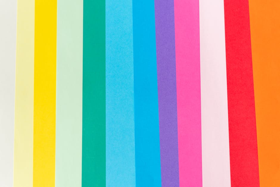
– Vibrant Combinations: Bright, energetic combinations of colors are trending. Look out for bold pairings like green and orange for a fresh, inviting vibe.
– Power of Blue: Blue continues to dominate as the most popular logo color with its connotations of calm, control, and confidence.
– Rise of Green: Green, symbolizing growth and new beginnings, is becoming a sought-after logo color.
– Return of Pastels: Pastel colors are making a comeback, offering a softer, more approachable feel.
– Bold and Bright: Expect to see a lot of bold, saturated colors in logo designs, reflecting a trend toward optimistic and energetic branding.

The Power of Two-Color Combinations
Knowing the upcoming logo color trends can be a game-changer when it comes to standing out from the competition. Exploring two-color combinations is an effective way to create a memorable and impactful logo. Here are some combinations that are sure to make your brand shine in the coming year.
Yellow and Blue: A Classic Duo
Yellow and blue make a great pair, combining the warmth and optimism of yellow with the cool, trustworthy vibe of blue. This color combination offers a bright, energetic feel that’s hard to miss. It’s a versatile duo that can work well for a variety of businesses, from technology companies to children’s brands.
Navy Blue and Teal Blue: A Modern Twist
The pairing of navy blue and teal blue offers a modern, sophisticated look. Navy blue conveys importance and confidence, while teal adds a refreshing, creative twist. This combination can portray a sense of reliability and innovation, making it a suitable choice for tech firms, consultancies, or financial institutions.
Black and Orange: Bold and Eye-Catching
Black and orange is a pairing that demands attention. Black adds a sense of solidity and strength, while orange injects energy and enthusiasm. This striking combination suits brands that aim to stand out and express boldness, such as sports companies or innovative startups.

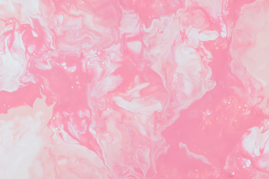
Plum and Pink Peach: Soft and Feminine
If your brand aims for a softer, more feminine appeal, consider a mix of plum and pink peach. This unique color combination exudes elegance and tranquility, perfect for businesses in the fashion, beauty, or wellness industry.
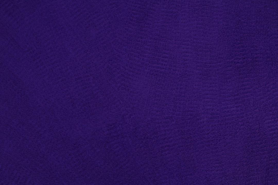
Dark Mauve and Turquoise: Unique and Trendy
For brands that want to communicate reliability and trendiness, a combination of dark mauve and turquoise can be an excellent choice. The soothing mauve paired with vibrant turquoise offers a unique and appealing contrast, ideal for high-end retail or cosmetics brands.
Dark Blue and Orange: A Balance of Warm and Cool
Complementary colors like dark blue and orange create a dynamic visual interest. Dark blue conveys trust and stability, while orange adds a splash of warmth and creativity. This balance can be particularly effective for brands aiming for a fun yet reliable image, such as travel agencies or educational platforms.

Incorporating these logo color trends into your brand’s visual identity can significantly enhance your brand recognition. At epIQ Creative Group, we can help you create a logo that perfectly captures your brand’s personality and resonates with your target audience.
The Dynamic of Three-Color Combinations
The rule of three applies in many areas of life, and when it comes to logo color trends, it’s no different. A palette of three colors can create a visually appealing and balanced design. Let’s explore some of the most effective three-color combinations that you can use to spice up your logo design.
Beige, Brown, and Dark Brown: Earthy and Natural
This color scheme exudes a warm, reliable, and earthy vibe, reminiscent of a comforting cup of coffee. These colors are especially suitable for brands in the food industry or those seeking to project a family-friendly image.
Blue, Yellow, and Green: Fresh and Vibrant
This combination of two primary colors (blue and yellow) and their secondary color (green) is youthful and energetic. It’s a fantastic choice for brands that want to appear fresh, innovative, and forward-thinking.
Dark Blue, Turquoise, and Beige: Cool and Calm
Dark blue, turquoise, and beige come together to create a confident and creative look. This color palette is particularly well-suited for brands in the travel, personal coaching, or healthcare industries that aim to project a sense of calm and professionalism.
Blue, Red, and Yellow: Primary Colors with Impact
Featuring the three primary colors, this vibrant and bold combination is sure to make your logo pop. It’s an excellent choice for brands that want to stand out and make a lasting impression.
Light Pink, Hot Pink, and Burgundy: A Gradient of Warmth
This combination of different shades of pink creates a friendly and innocent vibe, perfect for brands that aim to be seen as welcoming and approachable. The addition of burgundy adds a touch of professionalism, preventing the logo from appearing too naive.
Dark Blue, Yellow, and Beige: A Mix of Warm and Cool
This blend of warm and cool tones strikes a balance between professionalism and optimism. The beige subtly ties the dark blue and yellow together, creating a pleasing and harmonious visual effect.
At epIQ Creative Group, we understand the importance of color in logo design. Our expert designers are skilled at creating logos that not only look great but also perfectly convey your brand’s personality and values. Whether you’re looking to refresh your existing logo or create a new one, we’re here to help. Contact us today to start your logo design journey.
The Dominance of Blue in Logo Design
When it comes to logo color trends, one color consistently stands out from the crowd: Blue. This versatile hue has become the go-to choice for many brands and marketers worldwide. But why is this so?
Why Blue is the Most Popular Color for Logos
Blue is a color that signifies calm, control, logic, honesty, intelligence, security, purity, freedom, and confidence. Its soothing tones help establish trust-based relations and communicate a professional and serious vibe. This makes it an excellent choice for businesses that want to project reliability and trustworthiness.
But it’s not just about the psychology behind the color. The popularity of blue in logos can also be attributed to its versatility. Blue works well with a variety of other colors and can be used in different shades to create depth and interest in a logo. It’s no wonder that blue has been the top choice for many well-known brands, from tech giants like Facebook and Twitter to consumer product companies like Oral-B and Oreo.
How to Use Blue Effectively in Your Logo
Incorporating blue into your logo design doesn’t mean you have to stick to a single shade. Experiment with different tones to see what works best for your brand. For instance, a light, soft blue might work well for a wellness brand, while a deep, dark blue might be more suitable for a corporate or financial company.
Consider the emotions you want to evoke in your audience. If you want to communicate a sense of calm and tranquility, opt for lighter, cooler blues. If you want to project strength and reliability, go for deeper, richer blues.
Your logo is a visual representation of your brand, so it’s crucial to choose a shade of blue that aligns with your brand’s identity and values. At epIQ Creative Group, we understand the power of color in logo design and can guide you in choosing the right shade of blue for your brand.
In conclusion, blue’s dominance in logo design isn’t just a trend – it’s a testament to the color’s versatility and ability to evoke trust and reliability. Whether you’re starting a new business or rebranding an existing one, consider incorporating blue into your logo design. It’s a color choice that’s sure to stand the test of time.
The Trendy Colors of 2023
As we look ahead, logo color trends are already taking shape for 2023. Staying current with these trends can help your brand remain relevant and appealing to your audience. However, balance trends with your brand’s unique identity and values. Let’s dive into some of the colors expected to make a splash in the coming year.
The Rise of Green and Orange in Logo Design
In 2023, we expect to see a resurgence of green and orange in logo design. These two colors, while contrasting, can create a dynamic and engaging visual when used together. Green, often associated with growth and renewal, can convey a sense of freshness and vibrancy. This makes it an excellent choice for brands that want to project an image of innovation and forward-thinking.
Orange, on the other hand, exudes warmth and energy. It’s a color that captures attention and can inject a sense of excitement into your logo. Together, these colors can create a logo that is both striking and inviting.
At epIQ Creative Group, we’ve seen firsthand how the right color combination can enhance a brand’s identity. Our design experts can help you explore different color combinations, including green and orange, to find the one that best aligns with your brand.
The Attraction of Marvelous Magenta
According to the Pantone Color Institute, the official color of the year for 2023 is Viva Magenta. This color, derived from the red family, brings a vibrant spirit that is both joyous and powerful. Incorporating this color into your logo can help your brand project an image of confidence and vitality.
Whether you choose to use magenta as the primary color or as an accent color, its bold and vibrant nature can help your logo stand out. At epIQ Creative Group, we can help you incorporate this exciting color into your logo design in a way that complements your brand’s overall aesthetic.
The Hot Graphic Design Colors: Digital Lavender, Luscious Red, Sundial, Tranquil Blue, and Verdigris
Alongside green, orange, and magenta, other colors are expected to dominate the graphic design scene in 2023. These include Digital Lavender, Luscious Red, Sundial, Tranquil Blue, and Verdigris. Each of these colors has its unique appeal and can be used to convey different emotions and messages.
Digital Lavender is a modern and cool color that can add a touch of sophistication to your logo. Luscious Red, like magenta, is a vibrant and powerful color that can make your logo pop. Sundial is a warm and earthy color that can give your logo a grounded and reliable feel. Tranquil Blue, reminiscent of the sky and sea, can convey a sense of calm and stability. Lastly, Verdigris, a shade of green, can reflect growth and renewal.
Incorporating these hot graphic design colors into your logo requires careful thought and a keen eye for design. Our team of designers at epIQ Creative Group can help you navigate these color trends and choose the right colors that align with your brand’s identity and values.
Tools to Help You Incorporate Logo Color Trends
Staying on top of the latest logo color trends isn’t always as simple as it sounds, especially when you’re juggling other business responsibilities. Thankfully, there are several tools available that can simplify this process and allow you to experiment with different color combinations at your own pace. We’ll discuss two of these tools – Logoflow and Glorify – and how you can leverage them to incorporate current logo color trends into your brand’s logo design.
Using Logoflow for Experimenting with Color Combinations
Logoflow is a free online tool that allows you to play around with different color combinations for your logo. With this tool, you can experiment with various color palettes and see how they work together in real-time. This easy-to-use platform enables you to test out different color combinations until you find the one that best communicates your brand’s identity and values.
For instance, if your brand stands for reliability and warmth, you might want to experiment with shades of beige, brown, and dark brown, a color combination known for its warm and reliable vibe. Alternatively, if your brand is geared towards a youthful and vibrant audience, you might consider a lively mix of blue, yellow, and green.
Implementing Color Trends with Glorify
Once you’ve settled on the perfect color combination for your logo, it’s time to implement these colors into your branding. That’s where Glorify comes in. Glorify is a design tool specifically designed for e-commerce and marketing. It’s a great platform where you can implement your chosen colors into your branding materials, like your logo.
With Glorify, you can apply your chosen color palette to a range of templates, allowing you to see exactly how your logo will look in different contexts. This tool also allows you to adjust and refine your color choices as you go along, ensuring that your final logo perfectly aligns with your brand’s identity.
Incorporating current logo color trends into your branding doesn’t have to be a painful process. With the right tools, like Logoflow and Glorify, and some creative thinking, you can create a logo that not only represents your brand’s identity but also resonates with your target audience. And remember, our team at epIQ Creative Group is always here to provide expert guidance and support as you navigate through this process.
Conclusion
The Impact of Staying Current with Logo Color Trends
The world of design is ever-evolving, and keeping up with the latest logo color trends is a crucial part of maintaining a fresh and contemporary brand image. The colors you choose for your logo can have a profound impact on how your brand is perceived. Staying abreast of color trends can help your brand appear current, innovative, and in tune with your audience’s tastes and preferences.
Moreover, understanding and implementing color trends can enhance your brand’s visual appeal and make it more memorable. Colors can evoke certain emotions and associations, and using the right colors can help convey your brand’s personality and values effectively.
However, it’s not just about blindly following trends. The key is to incorporate these trends in a way that aligns with your brand’s identity and target audience. This can serve to enhance your brand’s unique appeal and resonance with your audience, leading to increased brand recognition and loyalty.
Final Thoughts on Incorporating Logo Color Trends
Incorporating the latest logo color trends doesn’t have to be a daunting task. With a strategic approach, a clear understanding of your brand, and a bit of creativity, you can successfully integrate these trends into your logo design.
The aim is not to drastically change your logo with each passing trend, but to subtly evolve it in a way that keeps it relevant and appealing. A well-designed logo with thoughtfully chosen colors can be a powerful tool in capturing attention, making a lasting impression, and ultimately, driving success for your brand.
As you embark on your logo design journey, don’t hesitate to reach out to us at epIQ Creative Group. Our team of design experts is ready to provide guidance and support, ensuring your logo not only stays on-trend but also truly represents your brand’s unique identity and vision.
For more insights on logo design and color trends, explore our educational resources or read our detailed article about logos. Happy designing!