Diving into the realm of visual storytelling can feel like uncharted territory. But fret not, you’re about to embark on an enlightening journey through the world of infographics! Welcome to our guide, ‘Infographic Design Secrets: Unleashing the Power of Visual Storytelling’. This is where we share the secrets of creating compelling infographics that not only look stunning but also effectively convey your message.
Infographics are powerful storytelling tools that can transform complex data into visually appealing and easily understandable content. Whether you’re an association leader looking to present annual reports in a more engaging way, a nonprofit striving to share impactful stories, or a small business aiming to showcase product features, infographics can work wonders for your brand.
However, the magic lies not just in creating an infographic but in designing one that can captivate, educate, and persuade your audience. Effective infographics have the potential to boost your brand recognition, enhance audience engagement, and amplify your content marketing efforts. But how do you create an infographic that is both attractive and impactful?
Stay tuned, as we guide you through the intricacies of infographic design, providing you with practical tips and insights that will enable you to harness the power of visual storytelling.
Understanding Infographics: Definition and Importance
Unraveling the secret to a successful infographic begins with understanding what an infographic is and why it matters. Infographics are powerful visual communication tools that present data, information, or knowledge in an easily digestible format. They combine text, graphics, and data to tell a compelling story, making complex information approachable, engaging, and memorable.
Infographics are more than just pretty pictures with statistics; they are a strategic blend of data storytelling and visual design. As we live in an era of information overload, the ability to convey complex ideas quickly and effectively is indispensable. This is where infographics shine – they can simplify the complex, highlight essential points, and provide context that breathes life into raw data.
The importance of infographics in today’s digital landscape cannot be overstated. A well-constructed infographic can increase comprehension, retention, and engagement. They are shared three times more often than any other type of content on social media, making them a potent tool for increasing brand visibility and engagement. Furthermore, infographics can support SEO efforts by encouraging backlinks and boosting dwell time on your website.
But it’s not just about throwing together some facts and figures with colorful visuals. A good infographic requires thoughtful design and effective storytelling, which we’ll delve into in the upcoming sections. Harnessing the power of infographics involves understanding your audience, structuring your narrative, choosing the right visuals, and applying design principles to enhance comprehension and memorability.
As a professional in a leadership role, you may be looking for innovative ways to communicate complex information, promote your brand, and engage your audience. Infographics could be just the solution you need. Stay with us as we unveil the secrets behind creating attractive and effective infographics that resonate with your audience and amplify your brand’s messaging.

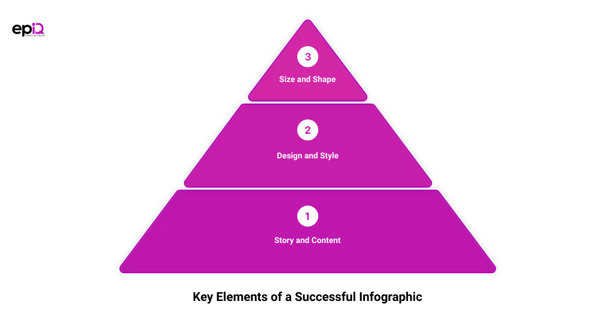
Key Elements of a Successful Infographic
Just as a building requires a solid foundation and well-planned architecture, a successful infographic also needs key elements to make it stand out and be effective. Here, we explore the four critical pillars that form the basis of any successful infographic.
Story: The Foundation of Your Infographic
In the world of infographics, story reigns supreme. The storyboard is the foundation of your infographic, acting as the building plan that guides your creation process. It’s not just about presenting data; it’s about weaving that data into a compelling narrative that grips your audience’s attention and guides them through the information you want to convey. Whether you’re educating clients or training employees, the story should be relevant, engaging and, most importantly, centered around your target audience.
Design and Style: The Visual Appeal
Design and style are the visual essence of your infographic. Mastering the basics of design, such as color psychology, balance, lines, typography, contrast, scale, proximity, hierarchy, repetition, direction, and space, can significantly enhance the visual appeal of your infographic.
For instance, understanding color psychology can help evoke the right emotions and set the tone for your content. Similarly, balance, achieved through an intelligent use of color, scale, and position, can create a sense of stability in your designs. Moreover, the appropriate use of contrast can help highlight critical elements in your design and create visual interest.
Remember, consistency in design elements like colors and fonts also plays a vital role in enhancing your brand recognition. Thus, the design and style of your infographic should not only be aesthetically pleasing but also align with your brand’s visual identity.
Information/Content: The Core of Your Infographic
At its heart, an infographic is a visual representation of information or data. Therefore, the information you choose to include forms the core of your infographic. This information should be relevant, reliable, and valuable to your audience.
It’s essential to keep the text to a minimum and let your visuals do most of the talking. While the information should be comprehensive, it must also be concise enough to be easily digestible. Remember, the primary purpose of an infographic is to simplify complex data and make it understandable at a glance.
Size and Shape: The Structure of Your Infographic
The size and shape of your infographic play a crucial role in its structure and readability. Too much information crammed into a small space can make your infographic look cluttered and difficult to read. On the other hand, an infographic that’s too large may seem daunting and discourage viewers from reading.
Therefore, it’s essential to strike a balance. The shape and size of your infographic should be guided by the amount and type of information you want to convey. For instance, a timeline or process might fit better in a vertical format, while comparisons or data distributions may work better in a horizontal layout.
In conclusion, a successful infographic is a harmonious blend of these four elements, each playing a crucial role in making your infographic attractive, engaging, and effective. By understanding and mastering these elements, you can create infographics that not only capture your audience’s attention but also effectively deliver your message.
How to Make Your Infographic Attractive and Effective: A Step-by-Step Guide
Creating an effective infographic is a strategic process that requires careful planning and execution. Follow these steps to ensure your infographic is both attractive and effective in conveying your message.
Step 1: Outline Your Goals for Creating Your Infographic
Start by defining the purpose of your infographic. Do you want to educate your audience, promote a product, or share interesting data? Having a clear goal will guide the design process and help you create an infographic that delivers the desired impact. Remember, the goal of your infographic should align with your overall content marketing strategy.
Step 2: Collect Data for Your Infographic
Data is the backbone of any infographic. Therefore, you need to collect relevant and accurate data to support your infographic’s story. This could be from your own research, industry reports, or trusted online sources. Be sure to verify the credibility of your data before using it in your infographic.
Step 3: Make Data Visualizations for Your Infographic
Once you have collected your data, the next step is to turn this data into visual elements. This could be in the form of charts, graphs, or pictograms. Remember, the goal of an infographic is to simplify complex information, so choose visualizations that make your data easy to understand.
Step 4: Create Your Layout Using an Infographic Template
A good layout is crucial for the success of your infographic. It helps guide your audience through the information and ensures a logical flow of data. If you’re unsure where to start, consider using an infographic template. These templates provide a predefined layout and style, which you can customize to suit your needs.
Step 5: Add Style to Your Infographic Design to Make it Stand Out
Finally, add some style to your infographic to make it visually appealing. This could be through the use of colors, fonts, and graphics. However, be careful not to overdo it. The style should enhance the readability of your infographic, not distract from the information. Also, make sure your style aligns with your brand identity to create a consistent look and feel across all your content.
By following these steps, you’ll be well on your way to creating infographics that not only look good but also effectively communicate your message. Remember, creating a successful infographic is not just about the design; it’s about telling a compelling story in a visually engaging way.

Tips to Enhance Your Infographic Design
You’ve got your story, your data, and your design lined up. Now it’s time to refine and perfect your infographic for optimum impact. Here are six essential tips that can take your infographic from good to outstanding.
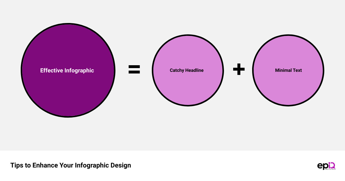
Write a Catchy Headline
The magic starts with a compelling title. A catchy headline is like a magnet—it draws your audience in. It is the first thing your viewer will read, so it needs to be impactful and succinct. It should provide a clear idea of what the infographic is about without revealing all the details. Consider creating a sense of intrigue or promising valuable insights to persuade your audience to dive deeper into the content.
Leave Plenty of White (Negative) Space
The beauty of an infographic lies not just in the graphics and data it contains, but also in the space it doesn’t. White or negative space gives your design breathing room, making it more digestible and visually appealing. It’s like the silence between musical notes—it helps to define and emphasize the information that is present. Leaving plenty of white space between different elements of your infographic can increase readability and reduce cognitive load for your audience.
Create the Infographic for Your Target Audience
Successful infographics resonate with their intended audience. Remember, you’re not creating this infographic for yourself—you’re designing it for your audience. Keep in mind their needs, preferences, and pain points. Use language that they understand and appreciate. If you’re targeting industry professionals, use jargon they’re familiar with. If your audience is the general public, keep your language simple and accessible.
Keep Text to a Minimum
In an infographic, less is more when it comes to text. Infographics are primarily visual content, and too much text can defeat their purpose. Use short, concise sentences and bullet points to get your message across. Remember, your visuals should do most of the talking. Use text to support and enhance your visuals, not to overshadow them.
Stick to a Single Topic
While it might be tempting to cram as much information as possible into your infographic, it’s best to stick to one main topic. Focusing on a single topic helps maintain clarity and prevents your infographic from becoming overwhelming or confusing. It also allows you to delve deeper into the subject matter, providing your audience with a more comprehensive understanding of the theme.
Ensure the Information Flows Like a Good Story
Finally, remember that an infographic is a visual story. Like any good story, it should have a clear beginning, middle, and end. This narrative structure helps guide your audience through the content, making the information more coherent and memorable. Use visual cues, like arrows or a clearly defined path, to guide your viewers through the story and help them make sense of the information.
By applying these tips, you can ensure that your infographic is not only visually appealing but also impactful and effective in conveying your message. After all, the power of an infographic lies in its ability to tell a compelling story visually. So, go ahead and unleash the power of your infographic design!

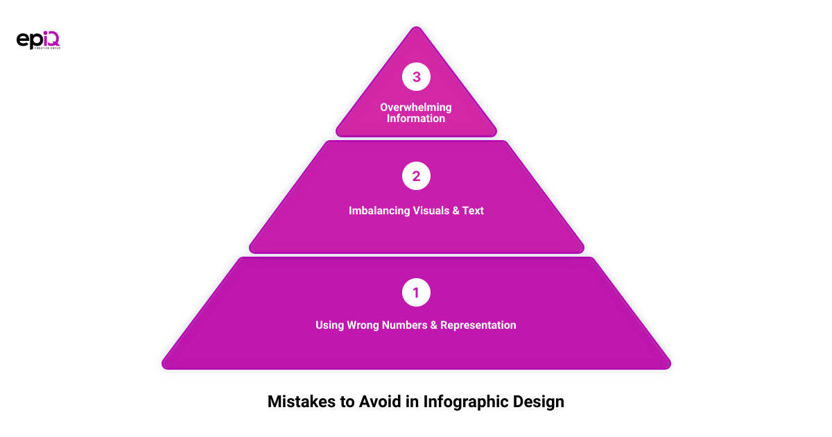
Common Mistakes to Avoid in Infographic Design
While infographics can be a powerful tool in visual storytelling, there are certain pitfalls that can hinder their effectiveness. By being aware of these common mistakes, you can ensure your infographic is both visually engaging and provides accurate and relevant information. Let’s delve into some of these common errors in infographic design and how to avoid them.
Using Incorrect Numbers
Nothing discredits an infographic faster than incorrect numbers. When handling data, especially statistical data, meticulousness is non-negotiable. An infographic loses all credibility when, for instance, percentages in a pie chart don’t add up to 100%. So, always double-check your facts and figures before publishing your infographic.
Selecting the Wrong Representation for Data
Matching your data with the correct chart type is crucial for an effective infographic. The type of your data determines the chart you need to use. For example, a bar chart is suitable for comparing values, while a pie chart is perfect for showcasing percentages that add up to a whole. Misrepresenting your data can lead to confusion and misinterpretation of the information you’re trying to convey.
Imbalancing Visuals and Text
Finding the right balance between visuals and text is a true art form in infographic design. Too much text can overwhelm the viewer, negating the main purpose of infographics – visual simplicity. On the other hand, an over-reliance on visuals without adequate explanatory text can leave the viewer confused. Striking a balance between the two is key.
Confusing People with Too Much Information
An effective infographic is one that is easy to understand at a glance. Avoid cluttering your infographic with too much information or overly complex visuals. A crowded infographic can be confusing and off-putting to viewers. Keep your designs clean, straightforward, and focused on a single topic for maximum impact.
Not Meeting the Qualities of a True Infographic
A true infographic is more than just a collection of images and text. It needs to have a clear structure, a logical flow of information, and a balance of visuals and text. Moreover, it needs to tell a story – your story. If your infographic lacks these qualities, it fails to fulfill its purpose as a visual storytelling tool.
By avoiding these common mistakes, you can ensure that your infographic is both attractive and effective, truly unleashing the power of visual storytelling. Remember, the goal is not just to create a visually appealing infographic, but to design one that effectively communicates your message to your target audience.
Utilizing Design Services for Effective Infographics: The Role of epIQ Creative Group
Let the magic begin. When it comes to crafting compelling infographics, professional assistance can make all the difference. Cue the entrance of epIQ Creative Group, a team that takes visual storytelling to the next level.
Infographic design is an art and a science – it involves meticulous planning, creativity, and strategic execution. epIQ Creative Group, with its team of highly skilled designers, has what it takes. They offer top-notch design services that empower you to execute your marketing strategies with confidence. From engaging social media graphics to eye-catching banners, logos, and of course, infographics, they ensure that every visual element resonates with your target audience and leaves a lasting impact.
But it’s not just about the design. Effective infographics are underpinned by powerful, engaging content. Understanding this, epIQ Creative Group provides a range of content marketing solutions for your infographics. These include email copywriting, articles or blogs, and even video content that is not only engaging but also optimized for search engines. They understand that great content not only attracts but also converts, and they ensure that every piece of content they create aligns with your brand message and marketing goals.
In the world of infographic design, innovation is key. epIQ Creative Group sets themselves apart with their unique approach to repurposing content. Using their innovative Clips2Tips service, they can transform your session videos into sneak-peak content for your infographic, providing a fresh and exciting way to engage with your audience and build anticipation for your event.
In today’s digital age, giving your infographic the social buzz it deserves can significantly amplify its reach and impact. With their Live2Social service, epIQ Creative Group creates a social buzz around your infographic, leveraging the power of social media platforms to increase engagement and boost your infographic’s visibility. This not only enhances your infographic’s presence online but also drives more engagement with your target audience.
In essence, through their comprehensive range of services, epIQ Creative Group ensures that your infographic design efforts are not just successful, but truly epic. With their strategic approach, creativity, and commitment to excellence, they are the partner you need to unlock the full potential of your infographic design. By choosing to work with epIQ Creative Group, you’re choosing to elevate your infographics from good to breathtakingly effective.
Conclusion: Unleashing the Power of Your Infographic Design
Congratulations, you’ve journeyed through the intricacies of creating compelling infographics that tell a story, engage your audience, and boost your brand. But remember, the art of infographic design is an ongoing process, and just like any other skill, it requires practice, evaluation, and refinement.
The power of an infographic lies in its ability to take complex data and turn it into a compelling, easily understood visual narrative. Infographics are more than just pretty pictures; they’re a potent tool in your marketing arsenal that can significantly enhance your brand’s visibility, increase engagement, and drive conversions.
To ensure that your infographics are not only attractive but also effective, remember the key elements: a strong story, compelling data, an impactful layout, and an engaging design that aligns with your brand identity. By mastering these elements, you can create infographics that stand out in the sea of content and resonate with your target audience.
Remember, consistency is key. Maintain a consistent style, color scheme, and font across your infographics to establish a recognizable visual identity for your brand. Also, don’t be afraid to experiment and innovate. The world of infographic design is constantly evolving, so stay ahead of the curve by pushing the boundaries of your design.
Moreover, don’t overlook the importance of a catchy headline, and remember to leave plenty of white (negative) space for easy readability. Keep text to a minimum and ensure the information flows like a good story. Avoid common pitfalls like using incorrect numbers, selecting the wrong representation for data, imbalancing visuals and text, confusing people with too much information, and not meeting the qualities of a true infographic.
But remember, you’re not alone in this journey. At epIQ Creative Group, we’re here to help you unleash the full power of your infographic design. Whether you’re a nonprofit looking to raise awareness, a small business aiming to increase customer engagement, or an association striving to communicate complex data, our team of experts can help you craft compelling infographics tailored to your goals and audience. We provide a comprehensive range of services, from logo and banner design to email copywriting and video production, to help you elevate your brand and engage your audience in innovative ways.
In conclusion, infographics aren’t just a trend; they’re an essential part of visual storytelling in today’s digital age. When designed effectively, they can be a powerful tool to communicate your brand’s story, values, and mission. So go forth and design, and start harnessing the power of infographics to tell your brand’s story in the most compelling way possible. Remember, the only limit to what you can create is your imagination.
