
Introduction: The Power of Infographics
In the age of digital marketing, infographics have emerged as a powerful tool that not only makes complex data understandable but also enhances the visibility of your brand. An effective infographic can transform dry, complex, and overwhelming information into an engaging, easy-to-understand, and visually pleasing narrative. This is a vital aspect for businesses, non-profits, and associations alike, who are looking to share data, insights, or processes in an impactful way that their audience can easily digest.
Infographics are a blend of design, writing, and analysis which are ideal for an age of significant data. This blend makes them particularly effective in the digital era where attention spans are short, and visual content is more engaging and readily shared on social media platforms. They can help in driving traffic to your website, increase content engagement, and even improve your Search Engine Optimization (SEO) efforts.
By creating an effective infographic, you can illuminate facts, bring clarity to complex issues, and tell a compelling story that connects with your audience. Whether you’re highlighting the impact of your non-profit’s work, sharing important industry data, or showcasing your business’s annual report, infographics can help you reach your goals.
However, creating an effective infographic requires thoughtful planning, strategic design, and careful execution. This guide will walk you through the step-by-step process of creating an infographic that not only looks great but also fulfills its purpose of informing, engaging, and influencing your audience. From defining your audience and setting your goals to selecting the right design elements and leveraging the final infographic, we’ve got you covered.
In the world of inbound marketing, where attracting, engaging, and delighting your audience is paramount, let’s explore how you can harness the power of infographics to propel your marketing efforts to new heights.
Understanding Infographics: History, Types, and Importance
The art of storytelling has taken a visual turn. In the age of digital marketing, where information overload is a common phenomenon, infographics have emerged as a compelling way to capture your audience’s attention. But to harness their full potential, you need to understand their roots, the diverse types available, and why they’ve become such a crucial tool in modern communication.
Infographics: A Brief History
Infographics, though seemingly a recent trend, have their roots in prehistoric times when early humans used symbols and drawings on cave walls to communicate stories, rules, and knowledge. Fast forward to the 21st century, we’ve replaced cave walls with digital screens, but the concept remains the same — using images to simplify complex information and make it more digestible.
Types of Infographics
Infographics come in various flavors, each serving unique communication needs. Here are a few types commonly used in digital marketing:
-
Process Infographics: Ideal for explaining complex processes or workflows that might be difficult for people to understand. They’re often used as a reference tool, demystifying abstract concepts like a customer journey.
-
Comparison Infographics: These are great for comparing and contrasting multiple options, products, plans, or ideas.
-
Data-Driven Infographics: Perfect for displaying research findings or survey results. They allow you to tell a story with your data, which can be particularly handy when sharing survey data on social media, a blog post, or a whitepaper.
-
Timeline Infographics: If you need to chronicle a series of events or give a historical overview, timeline infographics are your best bet.
-
List Infographics: These infographics are great for summarizing a long blog post or report, making it easy for readers to scan for the most important information.
The Importance of Infographics
Infographics simplify complex information into easily digestible, visually appealing content. They are a powerful tool for attracting visitors to your site, providing valuable information, and establishing your brand as an authority in your field.
Moreover, infographics have the potential to increase engagement significantly. They can be used to raise awareness about an issue or cause, putting a face to numbers and helping you tell a story with data.
In conclusion, understanding infographics’ history, types, and importance is the first step towards leveraging them effectively in your inbound marketing strategy. In the upcoming sections, we’ll take a deep dive into the process of creating effective infographics, right from defining your audience and goals to selecting the right design elements and promoting your final infographic. After all, your inbound marketing strategy should be a symphony of different content types, each playing a vital role in attracting, engaging, and converting your audience. And infographics are one of the lead performers in this symphony.
Step 1: Defining Your Audience and Goals for the Infographic
Your infographic is not just a pretty picture—it’s a strategic tool designed to communicate complex information in a simple, engaging manner. But before you dive into the design process, you need to nail down two essential elements: your audience and your goals. These elements form the foundation of your infographic and guide the decisions you’ll make in the steps to come.
Identify Your Audience
Like a compass guiding a ship, understanding your audience is the first step towards creating an effective infographic. This involves more than just knowing their demographic details. To create an infographic that resonates with your audience, you need to understand their interests, challenges, and the burning problem your infographic will solve.
Is your infographic aimed at educating clients about a new service, or is it for training employees on a new process? Maybe it’s a tool to raise awareness about a social issue, or a visual aid to support data-driven content in a blog post. Whatever the case, being clear about who your infographic is for will help you create content that’s relevant, engaging, and valuable to them.
Define Your Goals
Once you’ve identified your audience, the next step is to clearly define the goals of your infographic. And no, we’re not talking about high-level goals like improving website traffic or brand awareness. What we’re after are clear, concrete communication goals—actionable objectives that your infographic will achieve.
For instance, your goal could be to explain the steps in a complex process, persuade your audience about the importance of a certain issue, or provide useful tips for solving a common problem. Use a question pyramid to break down your main goal into 3-5 actionable questions that your infographic will answer. These questions will form the framework around which you’ll build your infographic, helping you create a compelling narrative that both educates and engages your audience.
Align Audience and Goals
Once you’ve defined your audience and your goals, make sure they align. The value your infographic offers should directly address a problem or interest of your audience. Plus, the desired outcome of your infographic should match what you want your audience to do or feel after consuming your content. This alignment ensures that your infographic is not just visually appealing, but also effective in achieving your communication goals.
Remember, the most successful infographics are those that are designed with a clear understanding of the audience and the goals they aim to achieve. This step might take some time and thought, but it’s an investment that pays off in the form of a well-crafted, impactful infographic.
Step 2: Choosing the Right Topic and Gathering Relevant Information
Choosing the right topic for your infographic is the first step to creating a valuable resource for your audience. The topic should align with your communication goals and provide a solution to a problem your target audience faces.
Identify the Burning Problem
The best infographics are focused on solving a specific “burning problem”. This could be anything from explaining a complex concept in a simplified manner, to providing a step-by-step guide on a specific process.
To identify the burning problem your infographic will address, consider your audience’s needs, interests, and challenges. Ask yourself, what is a common issue they face? What information would be most valuable to them? Once you’ve identified this, you have your topic.
Use a Question Pyramid
With your topic in hand, it’s time to break it down into actionable questions using a question pyramid. This process involves defining 3-5 key questions that your infographic will answer. These questions will guide your data collection and form the backbone of your infographic’s story.
For example, if your infographic is about the product design process, your question pyramid might look something like this:
- What is the product design process?
- What are the key stages in the product design process?
- What are the tasks and objectives at each stage?
Gather Relevant Data
Once you have your questions, it’s time to gather the data to answer them. This may require some research. While you may have some of your own data, often you’ll need to look externally.
Google is a great place to start your search. Utilize symbols and data-specific search terms to refine your search. If you’re searching for existing data sets, there are numerous data repositories to explore, like the U.S. Government’s Open Data, Statista, Kaggle, and Google Scholar, among others.
When gathering data, be sure to use reliable and trustworthy sources. Always verify the data and consider any privacy concerns or potential biases in the information.
Refine Your Google Searches
Remember, the key to a successful data search is specificity. Use exact phrases, exclude irrelevant terms, and append ‘data’ or a data-specific file format to your search phrase to narrow down your results.
By carefully selecting your topic and diligently gathering relevant data, you’re setting the foundation for an effective infographic that resonates with your audience and fulfills its purpose.
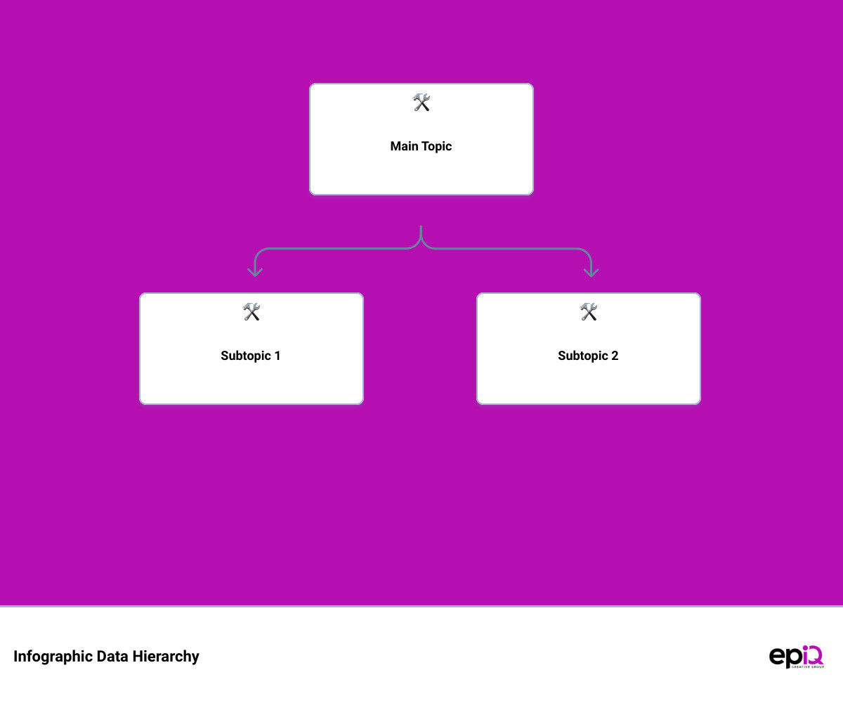
Step 3: Organizing Your Data and Creating a Logical Hierarchy
The raw data you’ve gathered is a gold mine of insights, but to unearth those nuggets of wisdom, you need to organize the data and create a logical hierarchy. This step is crucial in turning data into a compelling, easy to understand infographic. It’s about transforming numbers and stats into a story that captures your audience’s attention.
Understand Your Data
Start by thoroughly understanding your data. Identify trends, patterns, and outliers. What is the data telling you? What insights can you draw? Once you’ve understood the data, categorize it. This could be in terms of its importance, type, or relevance to the different sections of your infographic.
Create a Logical Hierarchy
The next step is to create a logical hierarchy. Prioritize the data based on its importance. The most crucial insights should come first, followed by supporting data.
A logical hierarchy is not just about the sequence of the data. It also involves grouping related data together. Using visual elements like lists, tables, or flowcharts can help you organize data effectively.
Choose the Right Visualization Strategy
Now that your data is organized, decide on the best ways to visualize it. The ICCORE method can be useful here. Determine whether the primary goal of each data piece is to inform, compare, change, organize, reveal relationships, or explore.
For instance, use a bar chart, column chart, bubble chart, or bubble cloud to compare independent values. On the other hand, use a line chart or an area chart to show changes that are continuous over time.
Map Out Your Infographic
Lastly, with your data organized and a visualization strategy in place, map out your infographic. Define the flow of information. Start with a compelling introduction, followed by your key insights, and wrap up with a strong conclusion.
Remember, creating an effective infographic is about telling a story. With your data organized logically and visualized effectively, your infographic will not just inform your audience but also engage and inspire them. In the next step, we’ll delve into selecting the appropriate type of infographic to best convey your data story.
Step 4: Selecting the Appropriate Type of Infographic
As a master chef carefully selects the right ingredients to bring a recipe to life, so too must you select the right type of infographic to effectively tell your data story. This step is crucial because it determines how your information will be visualized and how your audience will interact with it. But don’t fret, this doesn’t mean you need to be an expert graphic designer. With the right guidance and tools, you can choose the most effective infographic to engage your audience and meet your goals.
Understanding the Types of Infographics
There are several types of infographics to choose from, each designed to present data in a specific way. Some of the most common types include:
- Statistical infographics: These are designed to visualize complex statistical data in a digestible format. They are perfect for presenting survey results, important metrics, or demographic data.
- Informational infographics: These infographics are used to educate an audience on a particular topic. They break down complex information into easily understandable chunks.
- Timeline infographics: As the name suggests, these infographics are used to display a timeline of events or a step-by-step process.
- Comparison infographics: These are best used when you need to compare two or more things side-by-side.
- Geographic infographics: These infographics visualize location-based data using maps.
- Hierarchical infographics: These infographics show information in order of importance or magnitude.
- List infographics: These present information in a simple, straightforward list format.
Choosing the Right Type
Now that you understand the different types of infographics, the next step is to choose the one that best fits your data and your goals. To make this decision, consider the nature of your data, the story you want to tell, and what you want your audience to take away from it.
For instance, if you’re illustrating the history of your organization, a timeline infographic could work wonders. If you’re comparing the benefits of your product to a competitor’s, a comparison infographic would be best.
Remember that the type of infographic you choose should aid in your storytelling, not hinder it. The goal is to make your data more accessible and engaging, so choose a format that simplifies and clarifies your information, rather than complicating it.
Customizing Your Infographic
Once you’ve selected the right type of infographic, it’s time to customize it to fit your brand and message. Here, templates can be your best friend, offering a shortcut to a professional, attractive design. But remember, templates are just a starting point. Be sure to add your own touch, incorporating your brand colors, fonts, and images to make it uniquely yours.
In the end, the right infographic is the one that best tells your story, engages your audience, and aligns with your brand. So take the time to select wisely, and you’ll be well on your way to creating an effective infographic that resonates with your audience and achieves your goals.
In the next section, we’ll delve into how to develop engaging content for your infographic. So stay tuned!

Step 5: Visualizing Your Data: Strategies and Tools
Turn off the autopilot, folks, because we’re about to dive into the exciting world of data visualization! This step is where your infographic truly comes to life. With the right visuals, your data can tell a compelling story, engage your audience, and efficiently communicate complex information. So let’s explore the strategies and tools you need to turn your raw data into a captivating visual narrative.
Picking the Right Visualization
A key strategy in data visualization is selecting the right type of chart or graph for your data. The ICCORE method is a tried-and-true approach to help you make the right choice. It involves identifying the primary goal for each piece of data you want to visualize: to Inform, Compare, Change, Organize, Reveal relationships, or Explore. The visualization you choose should align with your goal.
For instance, if you want to inform your audience about a specific statistic, consider making it stand out with bold, colorful text, or pairing icons with text for extra emphasis. You could also use a donut chart or pictograph to highlight a percentage or rate. If your goal is to compare values, bar charts, column charts, bubble charts, or tree maps can be effective tools.
When it comes to showing change over time or space, line charts, area charts, timelines, choropleth maps, or map series can be quite revealing. To organize your data into groups, patterns, or order, consider using lists, tables, flowcharts, or even simple boxes or borders. And if you’re aiming to reveal complex relationships, scatter plots or multi-series plots could be your best friends.
Using the Right Tools
Once you’ve picked the right visualization strategy, the next step is to find the right tools to bring your data to life. There are many online tools available that make it easy to create beautiful and effective data visualizations for your infographic.
For instance, you can use a tool like Canva or Piktochart to create charts and graphs that you can easily customize and integrate into your infographic. These platforms provide a variety of templates and offer intuitive drag-and-drop features that make it easy even for non-designers to create professional-looking visuals.
Remember, the goal of data visualization in your infographic is to make complex information easily understandable. So keep your designs clean, simple, and focused. Use color effectively to highlight key points, and ensure there’s consistency in your design.
In the next section, we’ll get into how to develop engaging content for your infographic. But for now, take some time to experiment with different visualization strategies and tools. It’s all part of the fun – and the challenge – of creating an effective infographic. So go on, play around with your data, and let it tell its own unique story!
Step 6: Developing Engaging Content for Your Infographic
Creating an infographic that captivates your audience isn’t just about aesthetic appeal—it’s about delivering substance in a way that’s both informative and engaging. At this stage, you’ve already gathered your data, organized it, and found a suitable visualization strategy. Now, it’s time to bring it all together by developing compelling content that enhances your infographic’s narrative.
Make it Relevant and Actionable
Firstly, consider your target audience and the purpose of your infographic. Your content should be both relevant and useful to them. If your infographic is for educating clients or training employees, consider what they can take away from it. Eliminate jargon and use straightforward language they can understand. For example, an infographic about flu shots could provide actionable advice on prevention and preparation for the flu season. This direct relevance and practicality are what makes a good infographic.
Use Data Storytelling
Infographics are excellent storytelling mediums. They can guide your audience through information and leave a lasting impression. Use data storytelling techniques to convey your key messages. Introduce the topic briefly, provide some insights, and then delve into detailed points one by one. The visuals should support this storytelling, aiding the audience in understanding the message.
Choose a Suitable Layout or Template
The layout of your infographic should help navigate the information. Depending on your data, you might use an ordered list, a timeline, or a side-by-side comparison. Sometimes the information might be more complex and require a creative template to bring it all together coherently. Tools like Venngage offer various templates, including ones designed for facts and figures, geographically focused data, or step-by-step journeys.
Do Your Research
Align your infographic’s content with trustworthy and verifiable sources. Cite all your sources and put the data into an appropriate context for your audience. Ask yourself: Is the source trustworthy? Is the data verifiable? Are there any privacy concerns? Is the data suitable for the narrative? Remember, good infographics highlight accurate, meaningful, and well-researched information.
By following these steps, your infographic will not only be visually appealing but also rich in content and value. In the next section, we will delve into the design aspects of creating an effective infographic. Stay tuned!

Step 7: Designing Your Infographic: Best Practices
Creating a compelling infographic is not merely about selecting eye-catching images and colors. It encompasses understanding and mastering the fundamental rules of design, from contrast to balance, color psychology, and consistency. Let’s delve into these key design principles that you should incorporate into your infographic to make it not just visually appealing but also effective in conveying your message.
Use of Contrast in Infographic Design
Contrast is a powerful tool in your design toolkit. It can create visual interest and highlight important elements in your design. Achieving contrast can be done through variations in color, size, shape, and texture. It’s about making certain components stand out, drawing the viewer’s eye to the most important pieces of information. Remember, a well-contrasted infographic is more engaging and easier to understand.
Creating Symmetrical and Asymmetrical Balance
Balance plays a crucial role in making your infographic visually stable and harmonious. It doesn’t always mean perfectly symmetrical layouts; sometimes, asymmetrical designs can achieve balance through the clever use of color, scale, and position. For instance, you might create balance by positioning a larger, darker element on one side of your design and several smaller, lighter elements on the other. This kind of thoughtful arrangement can create a visually pleasing balance that guides the viewer’s eye through the information.
Effective Use of Color in Infographics
Color is one of the most influential tools in a designer’s toolkit. It can provoke emotions, capture attention, and convey messages without words. In infographic design, understanding color psychology can help you evoke the right emotions and set the tone for your content. For instance, blue is often associated with trust, red with excitement, and green with growth. Moreover, consistently using a specific color palette that aligns with your brand can cultivate a distinctive and instantly recognizable visual identity.
Ensuring Consistency in Infographic Design
Consistency is key in creating a successful infographic. This applies to your choice of colors, fonts, and graphic styles. Consistency in typography, for example, can drastically impact readability and the overall aesthetic of your infographic. Choose a set of fonts that reflect your brand’s personality and stick to them throughout the infographic. Similarly, consistent use of color and graphic styles ensures your infographic looks professional and cohesive.
Mastering these design best practices will not only make your infographic visually appealing but also more effective at communicating your key messages. In the next section, we will discuss how to customize your infographic template to further enhance its effectiveness.
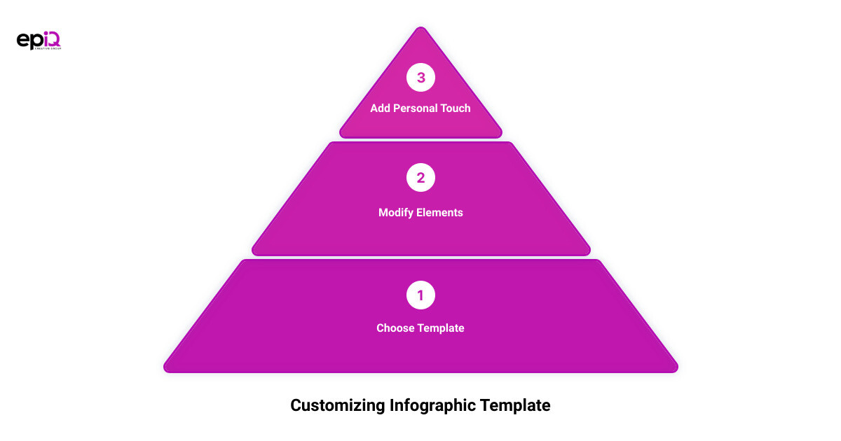
Step 8: Customizing Your Infographic Template
The creative journey doesn’t stop once you’ve chosen a suitable template for your infographic. In fact, this is where the real fun begins. Customizing your infographic template is an opportunity to let your brand’s personality shine through, making it more relatable to your audience. It involves tweaking elements like layout, color schemes, fonts, and images. In this section, we’ll walk you through the essentials of customizing your infographic template effectively.
Choosing the Right Tool for the Job
Firstly, it’s important to choose an infographic tool that matches your needs and skill level. Tools like Easelly, Canva, Adobe Express, and Pixlr come highly recommended for their user-friendly design interfaces and extensive template libraries. If you’re designing an infographic, Easelly might be your best bet, while Canva or Adobe Express may be more suitable for creating visually appealing social media posts.
Leveraging the Power of Templates
Templates are invaluable resources when it comes to infographic design. They are created by professional designers and provide a solid foundation for your infographic. But remember, templates are just the starting point. Feel free to customize them to suit your brand’s aesthetic and message. Use your brand’s color scheme, include your logo, and incorporate brand-specific fonts to create a cohesive brand identity.
Experimenting with Design Elements
Don’t be afraid to get creative with your design. Play around with different templates, colors, fonts, and images until you find what works best for your brand. Consider adding charts, graphs, or icons to represent your data visually. Remember, the goal is not just to create an infographic that looks good, but one that also resonates with your audience and effectively communicates your message.
Consistency is Key
Lastly, it’s important to maintain consistency across your infographic design. This means using similar fonts, colors, and styles across all elements of your design. A consistent design helps build a recognizable brand and makes it easier for your audience to process the information you’re presenting.
In the end, customizing your infographic template is all about finding a balance between creativity and consistency. By following these steps, you’re well on your way to creating an infographic that not only looks good but also effectively communicates your message. In the next section, we’ll discuss how to add branding elements to your infographic and promote it effectively. Stay tuned!
Step 9: Adding Branding Elements and Promoting Your Infographic
Unmask your brand’s personality with the stroke of a pen—or rather, the brush of a graphic design tool. In this step, we’ll explore how to infuse your brand’s identity into your infographic and promote it effectively to reach a wider audience. As you dive into this stage of infographic creation, remember: your brand is more than just a logo or color scheme—it’s a representation of your unique story and values.
Incorporating Your Brand Identity
Your infographic should be a visual extension of your brand, helping to reinforce the brand’s image in the viewer’s mind. Here’s how to do it right:
a. Logo Placement: Your logo is a vital element that should be included in your infographic. However, its placement should be strategic. It’s typical to place the logo either at the top or bottom of the infographic. However, it should not be so large as to distract from the content.
b. Color Scheme: Stick to your brand’s color palette when designing your infographic. Consistent use of colors creates a unified image that’s instantly recognizable as belonging to your brand.
c. Fonts: Your choice of fonts should align with your brand’s identity. Limit yourself to two fonts—one for the title and headers and one for the body text. The fonts should be easy to read and complement the overall aesthetic of your infographic.
Spreading the Word: Infographic Promotion
Creating an engaging infographic is only half the battle. The next step is getting it in front of your audience. Here’s how:
a. Social Media: Platforms like Facebook, Twitter, LinkedIn, Instagram, and YouTube are excellent channels for infographic promotion. Tailor your post according to the platform—for instance, short, snappy content for Twitter, and visually rich content for Instagram.
b. Blog Posts: Incorporate your infographic into a blog post to provide additional context and information. This could be an existing blog post or a new one created specifically for the infographic.
c. Emails: Sending your infographic via email newsletters is another effective way to reach your audience. Make sure to include a catchy subject line to increase open rates.
d. Partnerships: Partner with other businesses or influencers in your niche to share your infographic. This can help you reach a wider audience and increase your brand visibility.
Remember, an infographic is more than a pretty picture—it’s a powerful visual asset for your brand. Adding branding elements makes it a recognizable part of your brand, while effective promotion ensures it reaches as many eyes as possible. The result? Increased brand awareness, engagement, and ultimately, business growth.
How to Use Infographics as Advocacy Tools
As we transition from creating and promoting your infographic, let’s dive into another strategic use of infographics – advocacy. Infographics can be game-changers when used as advocacy tools, allowing you to communicate complex information or data in a simple, visually appealing way.
The Advocacy Potential of Infographics
Whether it’s for a library’s upcoming ballot measure, an awareness campaign for a nonprofit organization, or a small business trying to illustrate its impact on the local economy, infographics can tell a compelling story. They serve as succinct yet powerful tools to show all the activities and value that your organization provides. With a well-crafted infographic, you can communicate your message to your audience, board, or potential investors in a way that’s easy to understand and hard to forget.
For instance, the Eagle Valley Library District used an infographic to successfully advocate for their 2019 measure. The infographic illustrated the impact of the library on the community, showing the value the library provides in a visually engaging format. This made the information easy to digest and share, contributing to the successful passing of the measure.
Best Practices for Advocacy Infographics
When creating an infographic for advocacy purposes, remember these key points:
Ensure the infographic tells a story: Just like any other infographic, those used for advocacy should tell a compelling story. This could be the story of your organization’s impact, the problem your campaign is addressing, or the change you wish to see in the world.
Make your message clear: The purpose of your infographic should be clear to the viewer. Whether it’s to raise awareness, motivate action, or persuade voters, ensure this is communicated effectively.
Add your branding: Don’t forget to add your branding to your infographic. Not only does this increase brand recognition, but it also adds an element of trust and credibility to your message.
Promote widely: Once your infographic is ready, spread the word. Share it on your website, social media channels, and email newsletters. Encourage your followers to share it with their networks too.
Infographics aren’t just about presenting data or information in a visual format—they’re powerful tools that can move people to action. So, let your creativity flow, and craft an infographic that not only informs but also inspires.

Case Study: Successful Infographics and What We Can Learn from Them
In the world of infographics, the phrase “seeing is believing” truly holds water. Let’s delve into some remarkable infographics that have not only achieved their communication goals but also left an indelible mark on their audiences.
APHA’s Flu Shot Infographic: Making Complex Information Accessible
The American Public Health Association (APHA) created an infographic that provides clear and concise information on the importance of getting a flu shot. This infographic stands out because of its simplicity and its ability to make complex medical information easily understandable for the general public.
What we can learn from this is the power of simplicity. It’s crucial to eliminate jargon and use words that your target audience will understand. Also, this infographic is actionable; it provides information that the reader can directly apply, such as the best time to get a flu shot and other ways to prevent the flu.
Headway Capital’s Stress Management Infographic: Effective Storytelling
Another notable example is the stress management infographic by Headway Capital. This infographic effectively uses storytelling to introduce the audience to the topic, walk them through scientific insights, and offer practical strategies for stress management.
The key takeaway here is the importance of storytelling in infographics. A well-crafted narrative not only guides your audience through the information but also makes it more memorable. Additionally, the use of visuals in this infographic reinforces the narrative and makes complex information more digestible.
MarketingProfs’ Social Media Infographic: Clever Use of Template and Layout
MarketingProfs designed an infographic that includes a diverse set of information with quantitative data and categorical descriptions. The clever use of template and layout makes the information easy to read and understand, even though it isn’t presented as a linear story.
This example teaches us that the template and layout of an infographic are as important as the content itself. A well-structured layout can guide the reader’s eye and make the information more approachable.
Final Thoughts
Designing an effective infographic is not just about aesthetics; it’s about delivering information in a manner that resonates with your audience. By learning from successful examples, you can better understand how to simplify complex information, effectively tell a story, and structure your infographic for optimal readability. These insights, combined with your creativity and understanding of your audience, can lead to an infographic that not only looks good but also fulfills its purpose effectively.
Conclusion: The Impact of Effective Infographics on Your Business
From a catchy headline to a compelling narrative, the creation of an infographic is an art in itself. But the true power of an effective infographic lies in its ability to make an impact on your business. Let’s delve into what this impact looks like.
Boosting Brand Awareness
An effective infographic doesn’t just share information—it also promotes your brand. By incorporating your logo and website URL, you’re not simply creating a visual story but a shareable piece of your brand’s identity. This can lead to increased brand recognition, especially if your infographic catches the eye of influencers in your industry and gets shared widely.
Enhancing Social Media Engagement
Infographics are highly shareable, making them ideal for social media promotion. Posting infographics on platforms like Facebook, Twitter, and LinkedIn can boost your engagement rates, leading to more likes, shares, and comments. This increased interaction can subsequently improve your social media algorithms’ performance, leading to greater visibility and reach.
Simplifying Complex Information
Infographics are champions at breaking down complex information into digestible chunks. They make it easier for your audience to understand intricate data or processes, enhancing their learning experience. This not only positions you as an expert in your field but also builds trust with your audience, which is key to fostering long-term relationships.
Driving Traffic and Improving SEO
When your infographics get shared around the web, they can significantly increase traffic to your website. Plus, if you optimize your infographics with relevant keywords and backlinks, they can also contribute to your SEO efforts, helping your website rank higher in search engine results.
Increasing Conversion Rates
Finally, a well-designed infographic with a clear call-to-action can guide your audience towards taking the desired action, whether that’s signing up for a newsletter, downloading a resource, or making a purchase. This can lead to improved conversion rates, contributing positively to your bottom line.
To sum it up, investing time and resources in creating effective infographics can lead to far-reaching benefits for your business. They not only make your content more engaging and understandable but also boost your brand’s visibility, foster trust with your audience, and ultimately drive business growth. So, the next time you’re faced with a complex topic or a heap of data, remember the power of infographics. They might just be the key to unlocking new levels of success for your business.

Bonus: Resources for Further Learning and Infographic Creation Tools
Picking up where we left off, let’s delve into some excellent resources and tools that can further enhance your skills in creating compelling infographics.
In today’s digital age, it’s fortunate that numerous free tools and resources are readily accessible. These can help you design like a pro, even if you’re just getting started. Some of these fantastic design tools include Canva, Easelly, Adobe Express, and Pixlr.
Canva is a graphic design platform that allows users to create social media graphics, presentations, posters, and of course, infographics. It provides access to a wide variety of templates and design types, enabling you to create engaging content even without any design background.
Easelly is another free design tool that lets you create eye-catching infographics in minutes. You can choose from a host of ready-made templates or customize your own designs. It’s a great tool for transforming complex data into visually engaging content.
Adobe Express is a fantastic tool for creating social media designs. It offers a simple drag-and-drop editor and over 34,000 templates that you can customize to match your brand’s aesthetic. With Adobe Express, you can create not only high-quality graphics but also video content, making it a versatile tool for your content creation needs.
Lastly, for those who are more comfortable with photo editing, Pixlr is an excellent choice. This tool doubles as a photo editor and design tool, offering features like collages, photo filters, and layers. It also provides various pre-made templates and effects that can make designing quick and easy.
While having access to these tools is fantastic, knowing how to maximize their use can truly set your designs apart.
- Choose the right tool for the right job. For example, if you need to design an infographic, Easelly might be your best option. On the other hand, if you need to create a visually appealing Instagram story, Canva or Adobe Express may be more suitable.
- Make use of the templates provided. These templates are created by professional designers and are a great starting point for your designs. You can customize them to suit your brand’s aesthetic and message.
- Don’t be afraid to experiment. Play around with different templates, colors, fonts, and images until you find what works best for your brand. Remember, the goal is to create designs that not only look good, but also resonate with your audience.
- Keep your designs consistent. Consistency is key in building a recognizable brand. Use similar fonts, colors, and styles across all your designs to create a cohesive visual identity.
By utilizing these free tools and resources, you can create stunning and effective infographics without breaking the bank. Remember, a well-designed infographic is not just a tool to present data; it’s a powerful medium to tell a story, engage your audience, and reinforce your brand’s identity. So, go forth and design!