
Introduction: The Power of Infographics in Visual Storytelling
Imagine painting a vivid story with data. A story that not only informs but also captivates and engages your audience. This is the power of infographics in visual storytelling. As effective tools for data visualization, infographics can transform complex information into digestible, visually appealing content. They are a strategic blend of design, writing, and analysis that are ideal for an age of quick information consumption. Whether you’re a leader in a nonprofit organization or a small business owner, knowing how to craft engaging infographics can elevate your brand and resonate with your audience in a unique way.
In this article, we will delve into the intriguing ways to design and make infographics. From setting goals to visualizing data, selecting the right colors, and utilizing online infographic maker tools, we will guide you through each step of the process. We will also highlight how epIQ Creative Group, a company renowned for its affordable and high-quality design services, can help you in this journey.
So, are you ready to dive into the captivating world of infographics for visual storytelling? Let’s get started.
Understanding the Basics: What is an Infographic and Why Use It?
So, what exactly is an infographic? It’s a visual communication aid designed to present information in a clear and engaging manner. Infographics can be used to provide a quick overview of a topic, explain a complex process, display research findings, summarize a long blog post or report, compare multiple options, or raise awareness about an issue or cause. In essence, they are a powerful tool for visual storytelling, making complex or dry data more digestible and appealing.
But why should you use infographics? Well, we live in an age where information is abundant, and the challenge lies in getting your message noticed amidst the noise. Infographics are the perfect answer to this problem. Not only do they grab attention with their eye-catching visuals, but they also make information easier to understand. As a result, they can significantly increase engagement levels, making them highly effective for marketing and educational purposes.
Infographics come in handy in various scenarios. For example, if you’re introducing a new policy or process that might be hard for people to understand, summarizing the information with an infographic can clear up confusion. Or if you’re presenting research findings or survey data, infographics allow you to tell a story with your data, making it more engaging and memorable.
Furthermore, infographics can be incredibly shareable, especially on social media platforms like Facebook, Twitter, LinkedIn, Instagram, and YouTube. This means they can help amplify the reach of your content, giving your brand valuable exposure and potentially driving more traffic to your website.
Now that we understand the power and potential of infographics, the next step is to learn how to create one that’s engaging and effective. In the following sections, we’ll delve deeper into the process of crafting an infographic, from setting your goals to selecting the right design elements. Let’s dive in!
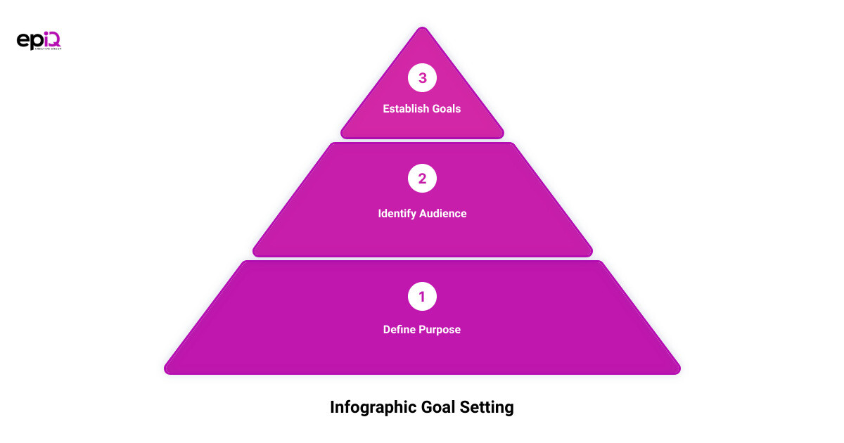
Step 1: Setting Goals for Your Infographic
An infographic without a clear purpose is like a ship without a rudder; it may look impressive, but it won’t get you far. Before you start designing, it’s essential to establish your infographic’s goals. This will guide your content selection, data visualization, and overall design approach.
The Importance of Defining Your Infographic’s Purpose
The purpose of your infographic should be more than just a vague aim to increase website traffic or summarize complex information. Instead, your goal should be a clear, concrete, achievable communication objective. Start by defining the burning problem your infographic intends to solve for your audience. Perhaps they’re confused about a new company policy, or they need a clear breakdown of your product’s features. Whatever it is, your infographic should provide a specific solution to this burning problem.
To help you define your problem and turn it into actionable questions, consider using a question pyramid. This method allows you to break down your problem into 3-5 targeted questions that your infographic will answer. These questions will form the framework of your infographic and guide your narrative.
Identifying Your Target Audience
In addition to defining your purpose, it’s crucial to understand who your infographic is for. This includes considering your audience’s age, gender, location, interests, and challenges. Knowing your audience will help you decide on the type of content, data, and design elements to include in your infographic. For instance, an infographic aimed at teenagers might use more vibrant colors and informal language compared to one targeting professionals in a corporate setting.
Remember, your infographic isn’t just a pretty picture—it’s a visual tool for communication. By defining your purpose and understanding your audience, you’re setting the stage for an infographic that’s not just engaging, but effective in conveying your intended message. With your goals now set, the next step will be to collect and organize your data, which we will cover in the following section.
Step 2: Collecting and Organizing Relevant Data
Data is the backbone of any effective infographic. It’s the raw material that drives your narrative and presents your story in a compelling and insightful way. But how do you find the right data? And once you have it, how do you organize it for effective storytelling? Let’s dive into these key aspects.
Strategies for Finding Relevant Data
Embarking on a data gathering mission can feel like diving into an ocean of information. But don’t be overwhelmed. With some smart strategies, you can navigate these waters and come up with the data gold you need for your infographic.
Google is your first ally in this quest. It’s often the best place to start your search. However, to make your Google searches more efficient, utilize symbols and data-specific search terms. For example, using quotes can help search for an exact phrase, while a minus sign can exclude terms from your search.
Existing data repositories are also a treasure trove of information, offering ready-to-use data on a range of topics. From the U.S. Government’s Open Data to user-uploaded datasets on Kaggle, these repositories can save you time and offer clean, usable data.
If these strategies fail, you might have to collect your own data. Conducting your own research and gathering data through surveys, interviews, or web analytics can provide valuable insights tailored to your specific needs.
How to Organize Your Data for Effective Storytelling
Once you’ve gathered your data, the next step is to organize it in a way that tells a compelling story. This is where the ICCORE method comes in handy. Developed to pick the best charts for your data, this method encourages you to determine the primary goal for each piece of data you want to visualize.
The goals could be to inform, compare, change, organize, reveal relationships, or explore. Depending on the goal, you can then choose the right chart or visual representation for your data.
For instance, if your goal is to inform, you could use large, bold, colorful text to make a numerical stat stand out. If your goal is to compare, you could use a bar chart or a pie chart. You need to think about what each piece of data is intended to do, and then use the best practices for that goal to find the right visual representation.
Remember, the way you organize your data can make or break your infographic. The data should flow logically, leading the viewer from one point to the next and building up to your main point or conclusion.
In the next section, we’ll look at how to choose the right infographic template to best display your organized data, supporting your storytelling and enhancing your audience’s understanding. So, let’s move on to choosing the right infographic template.
Step 3: Choosing the Right Infographic Template
Unleash your creativity and transform your organized data into a visual masterpiece with an effective infographic template. The right template can enhance your storytelling, captivate your audience’s attention, and ensure your message resonates.
The Role of Templates in Infographic Design
Infographic templates play a pivotal role in structuring your information and visual elements efficiently. They act as a roadmap, guiding your design process and providing a cohesive layout that aligns with your narrative flow. The right template organizes your data visually, simplifying complex information and making it easily digestible.
Moreover, it’s crucial to remember that the template you choose should align with your goals and cater to your target audience’s preferences. For instance, if your goal is to illustrate a process or timeline, a linear or flowchart template may be most effective. On the other hand, if you’re comparing data, a side-by-side comparison or Venn diagram template might be a better fit.
Examples of Effective Infographic Templates
Let’s explore some examples of effective infographic templates that you can use as a starting point for your design.
-
Comparison Infographics: These templates are excellent for direct comparisons, showcasing the differences and similarities between various concepts or items. They allow your audience to visualize contrasts and parallels quickly.
-
Timeline Infographics: Ideal for displaying chronological information or narrating a story over time. They help your audience understand the sequence of events or the progression of a process.
-
Process Infographics: These are perfect for explaining step-by-step processes or workflows. They guide your audience through a series of actions or stages, making complex procedures easier to follow.
-
Hierarchical Infographics: These templates are great for illustrating structures, like organizational charts or decision trees. They clarify the relationship between different levels or stages.
-
Data Visualization Infographics: Ideal for displaying statistical data, these templates use charts, graphs, or maps to represent numerical data visually.
Remember, the key is to choose a template that best serves your data and your storytelling goals. You can also make use of free design tools like Canva, Easelly, Adobe Express, and Pixlr, which offer a host of ready-made templates to kickstart your design process.
In the next section, we’ll delve into the exciting world of data visualization and how you can make your infographic more engaging. Stay tuned!
Step 4: Visualizing Your Data
Turning raw data into a visually appealing and understandable infographic is an art. It’s not just about making things look good, but also ensuring your data tells a captivating story. Let’s dive into how you can make your data sing!
Different Types of Charts and When to Use Them
Choosing the right type of chart or graph to represent your data is crucial for effective communication. The choice depends on the nature of your data and the message you want to convey.
For instance, if you want to inform your readers about a single important data point, consider making it stand out with bold, colorful text, or use a donut chart or pictograph. If your goal is to compare values or parts of a whole, then bar charts, pie charts, or tree maps may be your best bet.
When showing change over time or space, line charts, area charts, and timelines work well. For organizing data to show groups, patterns, rank, or order, consider using lists, tables, or flowcharts.
If you want to reveal relationships among different variables, scatter plots or multi-series plots can be very effective. Finally, if you want your readers to explore the data and discover insights for themselves, interactive charts that allow for filtering, sorting, and drilling down are often the best choice.
How to Make Data Visualizations Engaging and Understandable
Once you’ve selected the right type of chart or graph, the next step is to make your data visualization engaging and understandable. Here are a few tips to help you do just that:
- Keep it simple: Don’t overcrowd your charts with too much data. Keep the design clean and straightforward to ensure your audience can quickly grasp the information.
- Use color wisely: Utilize color to highlight important data points or to group related data. But avoid using too many colors, which can lead to confusion.
- Make it interactive: If possible, add interactive elements to your charts. This could be tooltips that provide extra information when hovered over, or filters that allow users to customize the view.
- Annotate your charts: Add labels, legends, and titles to help your audience understand what they’re looking at. But keep text to a minimum and let the visuals tell the story.
- Stay consistent: Use the same design elements, such as color, font, and style, across all your charts to create a cohesive look and feel.
Remember, the key to a successful infographic is not just about presenting data, but telling a story with it. Use these tips to ensure your data visualization is not only visually appealing but also narrates a compelling story that resonates with your audience.
In the next section, we’ll explore how you can add style to your infographic design. Keep reading to learn more about choosing the right fonts, using repetition and alignment, and selecting the perfect colors for your infographic.
Step 5: Adding Style to Your Infographic Design
After you’ve visualized your data and chosen the right infographic template, the next step is to add style to your infographic design. Styling is not just about making your infographic look pretty, but also about enhancing readability and comprehension. Let’s dive into some crucial elements of styling your infographic – choosing the right fonts, using repetition and alignment, utilizing negative space, and selecting the right colors.
Choosing the Right Fonts for Your Infographic
Text plays a fundamental role in conveying your infographic’s message. However, the way your text looks can drastically impact the readability and overall aesthetic of your infographic. The key is to keep it simple. Infographics are visual summaries, so the text should be concise and absolutely necessary to understand the primary concepts.
When selecting fonts, choose a readable font style for the bulk of the text, and amplify the size and style of your main header, section headers, and data highlights. This approach ensures that the gist of your infographic is immediately apparent to your readers.
The Art of Using Repetition and Alignment in Infographic Design
Repetition and alignment are two powerful design principles that can give your infographic a sense of rhythm and visual interest. By repeating basic shapes, you can reinforce the underlying grid of your design. Consistent alignment of elements, on the other hand, improves the balance and coherence of your infographic. Remember, even slight misalignments can throw your design off balance.
Utilizing Negative Space in Your Infographic
Negative space, also known as white space, refers to the areas of your infographic that do not contain any text or images. This space helps separate unrelated elements, making it easier for your audience to understand which elements are grouped together. Proper use of negative space ensures you have adequate margins around the edges of your infographic and between unrelated elements. In essence, negative space is as important as any other element in your infographic design.
Selecting the Right Colors for Your Infographic
Finally, let’s talk about color. Color is a powerful communication tool that can highlight important information, group related elements, and even evoke specific emotions. For instance, blue is often associated with trust, red with excitement, and green with growth.
However, a truly great infographic design should communicate effectively even in black and white. Think of color as an added bonus – a tool that can help your reader understand your content better.
In conclusion, adding style to your infographic design is not just about aesthetics but also about improving readability and comprehension. By choosing the right fonts, using repetition and alignment, utilizing negative space, and selecting the right colors, you can craft engaging infographics that not only tell a compelling story but also resonate with your audience.
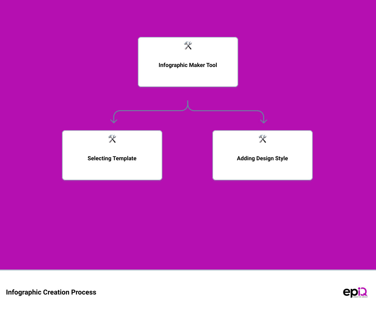
Step 6: Using Infographic Maker Tools
Having a well-crafted design is key to creating an engaging infographic. However, unless you are a seasoned graphic designer, you might find it challenging to bring your vision to life. This is where infographic maker tools come in handy. These tools are designed to make the process of creating infographics more accessible, even for those without a design background.
Overview of Popular Infographic Maker Tools
In this digital age, there are numerous free tools and resources that can equip you with the ability to design like a pro. Among these are Canva, Easelly, Adobe Express, and Pixlr.
Canva is a graphic design platform that provides access to a wide variety of templates and design types. It allows users to create social media graphics, presentations, posters, and other visual content. If you need to create an eye-catching infographic in minutes, Easelly is a great option. It offers a host of ready-made templates that you can customize to suit your needs.
Adobe Express is another fantastic tool that offers a simple drag-and-drop editor and over 34,000 templates that you can customize to match your brand’s aesthetic. Pixlr, on the other hand, doubles as a photo editor and design tool, offering features like collages, photo filters, and layers.
These tools provide various pre-made templates and effects that can make designing quick and easy. However, it’s crucial to remember that the tool you choose would depend on your specific needs. For example, if you need to design an infographic, Easelly might be your best option. On the other hand, if you need to create a visually appealing Instagram story, Canva or Adobe Express may be more suitable.
How to Create a Free Infographic Using Piktochart
Piktochart is another popular infographic maker tool that allows you to create engaging infographics for free. Here’s a quick guide on how you can create your own infographic using Piktochart:
-
Log into Piktochart: If you don’t have an account yet, sign up for free.
-
Choose a Template: Piktochart offers various infographic templates. Pick one that aligns with your content and design preferences.
-
Customize Your Template: Drag and drop images, icons, and illustrations onto your template. You can also customize the template to match your brand’s aesthetic by uploading your company font and choosing your color palette.
-
Add Your Content: Insert your data and relevant information into the template. Remember to keep your content concise and easy to understand.
-
Save and Download: Once you’re satisfied with your design, save and download your infographic.
Remember, the goal is to create designs that not only look good but also resonate with your audience. Don’t be afraid to experiment with different templates, colors, fonts, and images until you find what works best for your brand.
By utilizing these infographic maker tools, you can craft engaging infographics that effectively tell your story and connect with your audience.
How epIQ Creative Group Can Help You Create Engaging Infographics
You have now learned the art of creating infographics that tell a visual story, but you might be thinking, “I don’t have the time or the team to create these engaging infographics.” That’s where epIQ Creative Group comes into the picture. With their decade-long experience and commitment to your success, they can help you create visually appealing infographics that not only engage your target audience but also effectively communicate your brand’s message.
Overview of epIQ Creative Group’s Design Services
epIQ Creative Group’s design services stand out in the realm of infographic design. A compelling design can make a significant difference in attracting and retaining your target audience. Whether it’s the design of your website, social media graphics, or infographics, epIQ has a team of skilled designers who can bring your vision to life. They understand that design is not just about aesthetics; it’s about communicating your brand’s message and values in a visually appealing way that resonates with your audience.
The Quantum Circle™ Program: Monthly Design and Content Marketing Solutions
For businesses seeking a comprehensive solution to design and content marketing, epIQ offers the Quantum Circle™ Program. This proprietary system ensures accelerated sales and revenue scaling. It eliminates guesswork, saves you time and money, and provides a substantial return on your investment.
With Quantum Circle™, you will have direct access to growth marketers and regular progress reports, ensuring transparency and agility in your design and content marketing efforts. This program is particularly beneficial for businesses that need to create infographics regularly. The design team at epIQ will ensure each infographic is tailored to your brand and designed to engage and inform your audience effectively.
In conclusion, crafting engaging infographics need not be a daunting task for your business. With the right partner, like epIQ, you can effectively implement visual storytelling strategies that yield results. Their flexibility, cost-effectiveness, and commitment to your success make them an ideal choice for businesses seeking to boost their online presence and attract more customers. Explore their services today and see how they can help you tell your story visually.
Conclusion: Start Crafting Your Own Engaging Infographics Today
Just as a captivating story draws in its readers, a compelling infographic can capture and hold the attention of your audience. It’s time for your brand to harness the power of visual storytelling through infographics. By now, you have understood the basics, learned how to set clear goals, collect relevant data, choose the perfect template, and add a unique style to your infographic. You’ve also seen how using infographic maker tools can simplify the process for you.
Creating an engaging infographic doesn’t have to be an uphill battle. With the right approach, and the right partner, you can craft infographics that not only tell your story but also resonate with your audience, encouraging them to share your content and engage with your brand.
Remember, the key to creating successful infographics lies not just in presenting data, but in the art of storytelling. Your infographic should tell a cohesive story, using visual elements to guide your audience through the narrative, making complex data easily digestible and compelling.
But you don’t have to do it alone. At epIQ Creative Group, they understand the power of visual storytelling and are committed to helping businesses like yours create stunning, effective infographics. Their design services and the Quantum Circle™ program offer comprehensive design and content marketing solutions to help you elevate your brand.
So, why wait? Start crafting your own engaging infographics today and take your visual storytelling to the next level. The journey to compelling, engaging, and shareable infographics is just a click away.